The Art of Typography: Tips and Best Practices for Self-Published Authors
Typography is the art and technique of arranging type to make written language readable, appealing, and easy on the eyes. As a self-published author, paying attention to typography is essential to ensure that your work not only communicates effectively but also creates a lasting impression on your readers. A well-designed book layout, with proper font choices and typographic elements, speaks volumes about your professionalism and attention to detail. In this blog post, we will explore the importance of typography in self-publishing, along with tips and best practices to enhance the visual appeal and readability of your work.
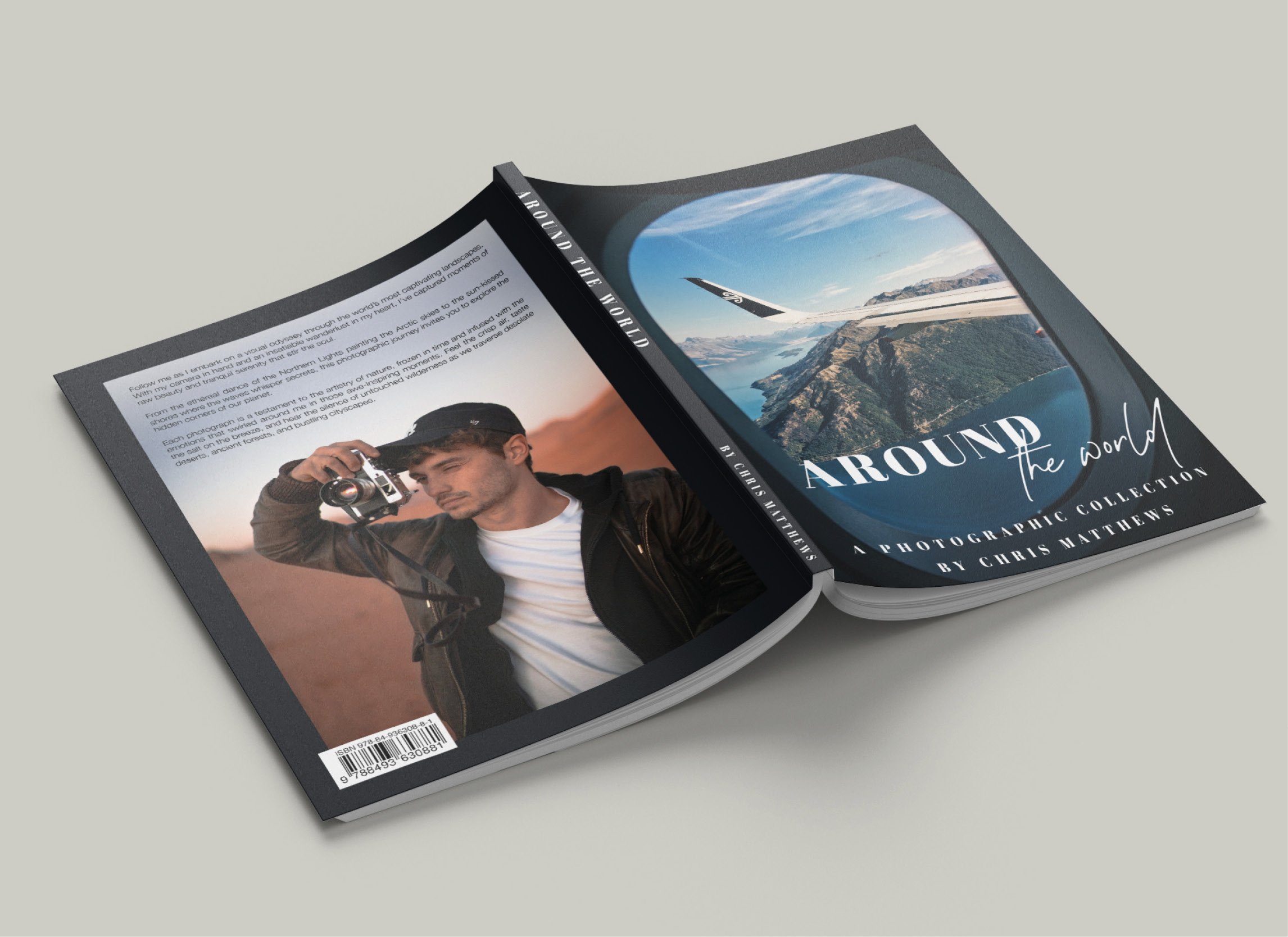
First impressions are crucial, and in the world of self-publishing, the initial impact is often created by the cover design and typography. Well-thought-out typography elevates your work from being merely legible to engaging, stimulating, and persuasive. Although the story's content is undeniably vital, it's the way the text is presented that ultimately makes the reading experience enjoyable and memorable.
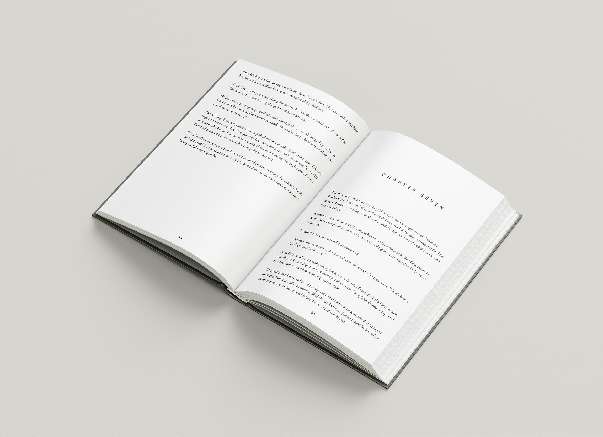
Taking the time to understand essential typographic principles, such as font selection, line spacing, and text alignment can make a significant difference in the success of your self-published book. It's important to ask yourself questions like: Is my choice of font appropriate for my target audience? Does the font style convey the tone and style of my writing? Does the layout of my book facilitate easy reading without overwhelming the reader with large chunks of text?
To delve deeper into the world of typography, our guide will cover various aspects such as choosing the right font, setting appropriate margins, and optimising line spacing and alignment. By implementing these practices, we hope to leave you equipped with the tools to create a beautifully formatted work that captivates your readers and highlights your literary prowess. Let's take this journey together and transform your self-published book into a typographic masterpiece.
1. Choosing the Right Typeface for Your Book
Selecting the appropriate typeface is crucial in setting the tone and style of your work. Various typefaces evoke different emotions and reactions from readers. To make the right choice, consider the following:
Genre-Specific Typefaces: Certain fonts work well for specific genres. For example, serif fonts such as Garamond or Caslon are generally suitable for traditional fiction and non-fiction, while sans serif fonts like Helvetica or Futura may be apt for contemporary works or text-heavy technical books.
Legibility: Ensure that the font you choose is highly legible and comfortable to read, both in print and on digital devices.
Emotional Impact: Consider the emotional impact the font has on readers. Seek fonts that resonate with the mood and theme of your work. Avoid ultra-stylised or gimmicky typefaces that may detract from the content.
2. Mastering Margins and Page Layout
Setting appropriate margins and organising your page layout professionally can significantly impact the overall readability and aesthetics of your book. Keep the following in mind:
Margins: Ensure that your book has ample and balanced margins to provide readers with a comfortable reading experience. Take into account factors such as gutter margins (the inner margins), which may require more space to accommodate for bookbinding.
Page Numbering: Place page numbers in a location that is easy to locate but not distracting to the reader. Common placements include the top or bottom outer corners or centred at the bottom of the page.
Headers and Footers: Decide whether your book requires headers and footers. A header may include the book title, chapter title, or author's name, while a footer may contain information such as page numbers, footnotes, or website links. Ensure they are consistently styled and positioned throughout the book.
3. Optimising Line Spacing, Alignment, and Text Formatting
Line spacing, alignment, and text formatting are critical elements to ensure a smooth and visually pleasing reading experience. Consider the following tips:
Line Spacing: Use appropriate line spacing (also known as leading) to facilitate easy reading. Too little space may cause words to merge, while too much space can make it difficult to follow the text. A general guideline is to use spacing between 1.2 - 1.5 times the font size.
Alignment: The alignment of your text will depend on your content and personal preference. Left-aligned text is the most common choice for books and is generally the easiest to read. Justified alignment can produce a clean, even look but may cause uneven spacing between words.
Formatting: Use italic, bold, and underlined text sparingly and strategically to emphasise specific words or phrases. Overusing these elements can make the text appear cluttered and challenging to read.
4. Perfecting Your Chapter Headings, Subheadings, and Breaks
Consistent and visually engaging chapter headings, subheadings, and breaks can guide your reader through your work while adding visual interest. Take note of these suggestions:
Consistency: Maintain consistency in the formatting and layout of chapter headings, subheadings, and breaks throughout your book. This includes the font, size, alignment, and style of these elements.
White Space: Utilise white space effectively to create visual breaks and guide your readers through your content. This can be achieved with chapter breaks, section breaks, or even paragraph breaks when introducing new ideas or scenes.
Hierarchy: Establish a clear hierarchy for headings and subheadings to make it easy for readers to identify the structure and organisation of your content.
Typography is an essential yet often overlooked aspect of self-publishing. By mastering fundamental typography principles and implementing best practices, you can create a visually appealing, engaging, and easy-to-read book that leaves a lasting impression on your readers. From font selection and the layout to line spacing and chapter headings, a well-executed typographic plan is key to ensuring your literary masterpiece reaches its full potential.
We understand the importance of creating polished, professional, self-published works. Our team at Spine Book Printing is ready to assist you in navigating the complex world of typography and book printing for self-publishers, offering guidance to make your book visually stunning and accessible. Let us help you bring your vision to life, creating a beautiful, high-quality book that is a delight for both the eyes and the mind.