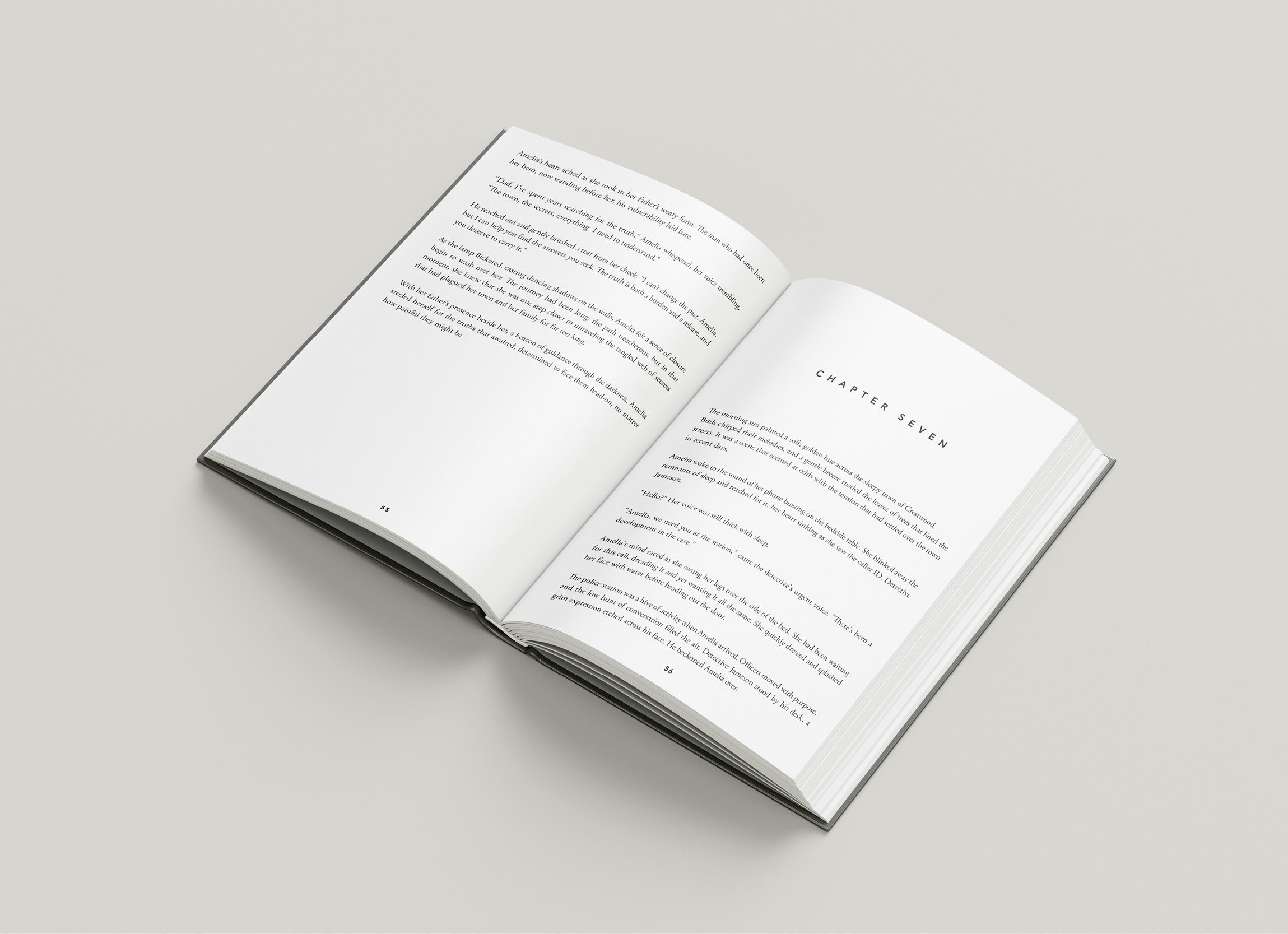
Mastering Book Interior Design: Tips for a Professional and Engaging Layout
While having an eye-catching book cover is essential for capturing the attention of potential readers, the interior design of your book is equally important in delivering an enjoyable reading experience. As a self-published author, investing in a professionally designed book interior can elevate your work, making it indistinguishable from traditionally published books and giving you a competitive edge. In this blog post, we will delve into the nuances of book interior design and share with you actionable tips for creating an engaging, polished layout that does justice to your hard work.
A visually appealing book interior not only adds to the overall charm of your publication but can also boost readability, ensuring your readers have a comfortable and enjoyable experience as they immerse themselves in your work. Aspects of book interior design such as typeface, margins, and spacing may be easily overlooked, but they significantly impact how your readers perceive your writing. A well-designed layout not only enhances the reading experience but also reflects your professionalism, boosting your credibility as a self-published author.
When creating the perfect interior design for your book, it's essential to approach the task with a blend of creativity and consideration for practicality. By keeping your target audience's preferences and expectations in mind, you'll be better equipped to craft a layout that suits their reading habits. Moreover, balancing the elements of your book’s design to enhance the content rather than distract from it should be your top priority.
In the following sections, we will explore various aspects of book interior design, from choosing the appropriate font and page size to mastering paragraph formatting and visual embellishments. By applying these tips and techniques, you will be well on your way to producing a book that is not only visually appealing but ensures a smooth and enjoyable reading experience for your audience. So, let's delve into the world of book design and transform the interior of your literary masterpiece!
1. Choosing the Perfect Typeface: Balancing Readability and Style
The typeface you select for your book is a critical component of its interior design, as it sets the tone for your narrative and plays a significant role in the readability of your work. Here are some crucial points to keep in mind when selecting the ideal typeface:
Opt for a Serif Font: Serif fonts (those with small lines, or "serifs", at the end of each stroke) are typically easier to read in print, as the serifs guide the reader's eyes from one word to the next.
Consider the Genre: The typeface you choose should complement the theme and tone of your writing. For example, a classic font like Garamond may be well-suited for literary fiction, while a modern font like Arial or Helvetica could be appropriate for non-fiction or technical books.
Test Readability: Make sure your chosen font is legible and comfortable to read on a printed page. Check whether the font is easy to decipher when printed in black and white, and ensure it remains readable at various sizes.
2. Formatting Paragraphs and Text Blocks: The Art of Spacing and Indentation
Properly formatted paragraphs and text blocks are essential for creating a polished, professional look for your book's interior. Pay close attention to the following formatting elements:
Line Spacing: Avoid excessively tight or loose line spacing, as both can hinder readability. The standard line spacing for most books is around 1.3 to 1.5 times the size of your chosen font.
First-Line Indents: Indenting the first line of each paragraph (except for chapter openings) is a simple way to indicate a separation between ideas. Generally, the indent should be set at 0.5cm, but it ultimately depends on the font size and page size.
Justification: Full justification typically creates a sleek, professional appearance when done correctly. However, ensure that the spacing between words and characters is balanced to avoid unsightly gaps or overly cramped text.
3. Mastering Page Layout: Page size, Margins and Headers
The overall layout of your book is crucial for delivering a comfortable and visually appealing reading experience. Keep these points in mind when setting up your page layout:
Selecting Page size: The choice of page size depends on your book's genre and target audience. For instance, A5 size often works well for novels, while A4 size is suited for technical books, textbooks, or workbooks. Ensure that the chosen page size is aligned with your readers' preferences and expectations.
Setting Margins: Providing adequate margins is essential for improving readability and avoiding text being cut off during the printing and binding process. Inner margins should typically be larger than outer margins to accommodate the gutter, where the pages are bound together. Stick to the industry standard of 1.25cm for outer margins and 1.5cm for inner margins as a starting point, tweaking the numbers as needed.
Incorporating Headers: Including headers—such as page numbers, chapter titles, or the book title—on each page adds a professional touch. However, ensuring they do not distract from the main text is essential. Maintain a consistent font, size, and style for headers throughout the book, and provide ample space between the text block and the header.
4. Embellishing with Visual Elements: Enhancing Your Content
Visual elements such as illustrations, charts, and decorative symbols can enrich your book's content and provide a pleasant reading experience. Nonetheless, it's crucial to use visual elements sparingly and ensure they serve a specific purpose. Consider the following suggestions:
Choose Consistent Styles: Select a consistent style or theme for your visual elements that complements your book's overall design and tone.
Integrate Visuals Purposefully: Incorporate visuals, such as images or decorative flourishes, where they contribute to the content or enhance the reader's understanding of your narrative. Be mindful of the balance between text and visuals, and avoid cluttering your pages.
Investing time and effort into creating a professional and engaging book interior design can significantly enhance the reading experience and elevate your self-published work to new heights. By carefully selecting the appropriate typeface, mastering paragraph formatting and page layout, and thoughtfully incorporating visual elements, you'll create a visually appealing book that reflects your dedication to quality and boosts your credibility as an author.
When it comes to print and binding choices, we understand the value of producing a beautiful self-published book that readers will cherish. At Spine Book Printing, we're here to guide you through every step of the self-publishing process, ensuring that your hard work is translated into a professionally printed and bound masterpiece. Together, let's bring your literary vision to life!


