A Comprehensive Guide to Formatting Your Self-Published Book: Best Practices for a Professionally Polished Manuscript
A beautifully written and captivating story is the heart of any great self-published book; however, proper formatting is the backbone. An immaculately formatted manuscript not only ensures readability and enhances the overall reader experience but also elevates your work to a professional standard that can hold its own in the highly competitive literary market. As self-published authors, it is essential to master the art of formatting to guarantee that our books are judged by their content rather than their presentation, bolstering our credibility and reputation in the eyes of readers and industry professionals.
In this guide, we will explore the critical aspects of formatting your self-published book - from crafting an impeccable layout and structure to refining your book's design elements. We will dive into best practices for font selection, paragraph spacing, and pagination, as well as tackle crucial formatting considerations related to printing options, paper choices, and cover lamination. By the end of this guide, you will possess the knowledge and confidence required to transform your manuscript into a professionally polished masterpiece that captivates readers from the moment they pick it up.
Whether you are new to the world of self-publishing or a seasoned author seeking to elevate your work's presentation, this guide offers invaluable insights to help ensure your manuscript is formatted with the utmost precision and care. Join us as we delve into the intricacies of book formatting, equipping you with the tools to create a self-published book that embodies excellence in both content and presentation. With a well-formatted, meticulously structured, and reader-friendly manuscript, your literary work can shine brilliantly and captivatingly, allowing your talent to shine as it rightly deserves.
1. Perfecting Your Book's Structure and Layout: Building a Reader-Friendly Foundation
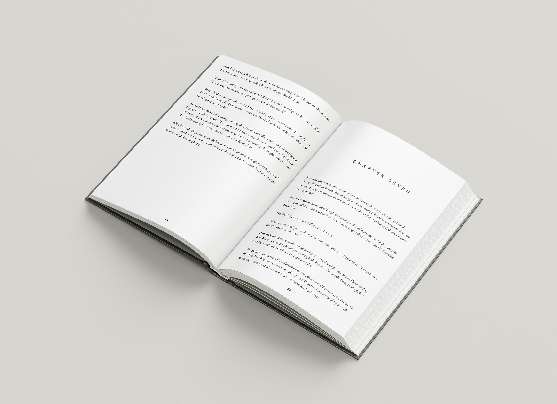
To create a reader-friendly manuscript, it is essential to establish a well-organised structure and layout that eases navigation and enhances readability. The following steps are instrumental in perfecting your self-published book's structure:
- Front matter: Ensure that your book's front matter includes essential elements such as a title page, copyright page, dedication (if desired), contents page, and any relevant preface or acknowledgements.
- Chapters and sections: Begin each chapter on a fresh page and use consistent formatting for chapter headings and subheadings, along with a uniform numbering system for sections and/or chapters.
- Page numbers: Incorporate page numbers unobtrusively in the top or bottom margin, using either Arabic numerals or Roman numerals for the front matter, as is customary in your book's genre.
- Margins and gutters: Set consistent margins on all sides of your book, including the gutter margin (space between the printed text and spine). This ensures ample room for easy reading and efficient binding.
2. Choosing the Right Font and Typography: Balancing Aesthetics and Readability
The choice of font and typography plays a significant role in your book's overall aesthetic and readability. Make informed choices by considering these crucial points:
- Font style: Choose a font that aligns with the tone and genre of your book while prioritising readability. Serif fonts, such as Garamond and Times New Roman, are popular choices for print due to their traditional and easy-to-read appearance.
- Font size: Select a font size that is both comfortable and consistent with industry standards for your genre. Typically, a 10 to 12-point font is considered standard for the main text.
- Line spacing: Ensure that your text is neither too cramped nor overly spaced by setting consistent line spacing. A 1.5 or double line spacing can improve readability, while single spacing may be used for more technical or reference texts.
- Text alignment: Choose whether to align your text to the left margin (with a ragged right edge), justify it to create a clean and uniform appearance on both sides, or centre your headings and subheadings.
3. Navigating Pagination and Section Breaks: Ensuring a Smooth Reading Experience
Optimising your book's pagination and section breaks can promote a seamless reading experience and prevent disruptive blank pages or awkwardly split content. Keep the following principles in mind:
- Avoid widows and orphans: Widows are single lines of text at the end of a paragraph that appears at the top of a new page, while orphans are the last lines of a paragraph appearing alone at the bottom of a page. Aim to avoid these by adjusting your paragraph spacing or text flow as necessary.
- Use consistent section breaks: Incorporate appropriate section breaks or page breaks to separate major parts of your book and ensure uniformity when transitioning between chapters, sections, or front and back matter.
- Page count considerations: Be mindful of your book's total page count, as this can impact your printing costs and the final appearance of your book, particularly when choosing binding options and paper styles.
4. Mastering the Art of Visual Design: Fine-Tuning Graphics, Images, and Decorative Elements
Visual design elements can enhance the appeal of your self-published book and contribute to a polished, professional appearance. Consider the following factors when incorporating graphics, images, and decorative elements:
- Halftone images: If your book requires the inclusion of black-and-white images, converting them to halftone can improve print quality and consistency and reduce the risk of uneven ink distribution.
- Consistent image sizing and placement: Ensure that images are of consistent size, resolution, and placement within your text, enhancing the overall visual harmony of your manuscript.
- Decorative embellishments: If appropriate for the tone and genre of your book, consider incorporating decorative elements such as drop caps, calligraphic dividers, or tasteful borders. Employ these embellishments judiciously and consistently to add character without undermining readability.
Conclusion
A thoughtfully formatted and well-structured self-published book can captivate readers and elevate your work to the highest professional standards. By incorporating best practices for layout and structure, font and typography, pagination, and visual design, you can create a manuscript that marries aesthetic elegance with readability, resulting in an irresistible and unforgettable literary experience.
At Spine Book Printing, we are honoured to partner with aspiring self-publishers in the UK like you, offering our expertise and support to help bring your stories to life in a way that truly underscores their worth. Together, we can create masterpieces that dazzle readers and elevate your literary talent to new heights in the realm of self-publishing.

