Mastering the Art of Layout Design for Your Self-Published Books
As a self-publishing author, ensuring that your book is the best version of itself involves more than just perfecting its content and cover design. The interior layout of your book – the way in which text and images are arranged on each page – plays a crucial role in creating a professional, engaging, and enjoyable reading experience for your audience. From typography and margins to headers, footers, and chapter breaks, mastering the art of layout design is essential to not only set your book apart from the competition but also to provide a seamless reading journey that keeps readers hooked until the very last page.
In the world of self-publishing, every detail counts, and creating an effective book layout design is no exception. Various elements work together to create a harmonious and visually appealing book; understanding how to achieve this balance while ensuring optimal readability can be a challenge for even the most seasoned self-publishing authors.
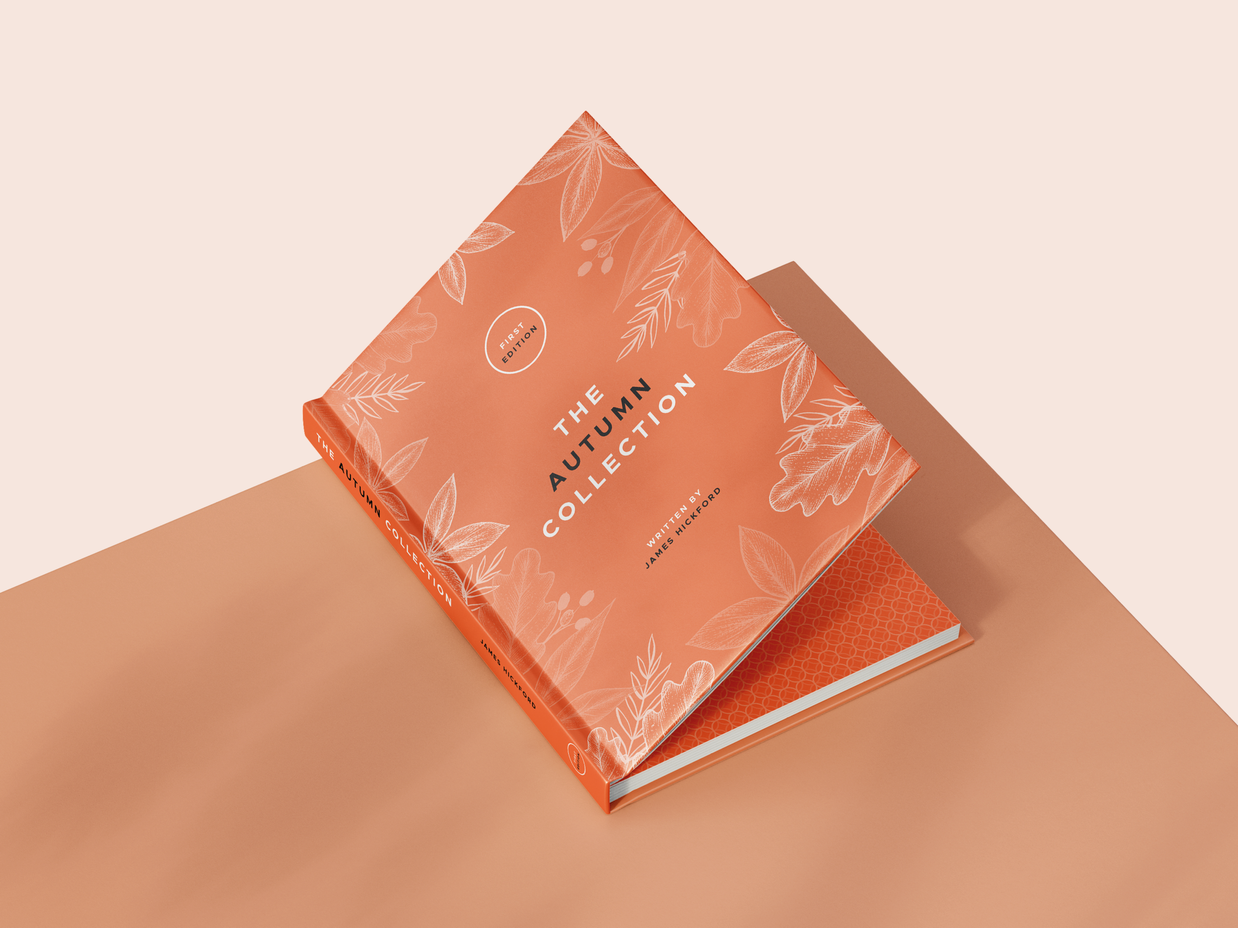
Our team at Spine Book Printing understands the importance of exceptional layout design for self-published books. From offering insight into various printing choices such as hardback or paperback binding, novel, A4, or A5 size, 100gsm uncoated or 150gsm silk paper, and matt or gloss cover lamination to providing support in selecting the right print type (black & white or colour), we're here to ensure your self-publishing journey results in a high-quality, professional final product.
Selecting the Right Typography: Balance and Readability
Your book's typography heavily influences a reader's experience, so it's essential to select fonts that complement your content and maintain readability. Consider these factors when making your typography choices:
Legible Fonts: Choose fonts that are easy to read, especially for large blocks of text. Aim for serif fonts for traditional print books, such as Garamond, Caslon, or Baskerville, and sans-serif fonts for digital publications, like Arial, Verdana, or Calibri.
Font Pairing: When using multiple fonts, ensure they work together harmoniously without clashing or competing for attention. Seek guidance from online font pairing tools or design resources to make the best choices.
Font Hierarchy: Establish a hierarchy through various font styles and sizes, setting different styles for headings, subheadings, and body text. Consistency is key to maintaining a clean and professional appearance throughout your book.
Creating Effective Margins and Spacing: Proper Breathing Room
Well-considered margins and spacing are essential for the overall aesthetic of your book layout, providing ample room for text to breathe and ensuring a pleasant reading experience. Keep the following in mind when setting margins and spacing:
Margins: Establish balanced and consistent margins around the edges of your pages, providing sufficient space for gutter margins (where pages are bound together) and ensuring your text doesn't appear cramped.
Line Spacing: Adjust line spacing (leading) to maintain legibility and avoid overcrowding, but be cautious not to create unnecessarily large gaps between lines, which can disrupt the flow of text.
Paragraph Spacing: Find the right balance between paragraph spacing and indentation, allowing readers to easily distinguish between paragraphs without wasting valuable page space.
Widows and Orphans: These are single lines left at the top or bottom of a page and single words left on a line. Address these issues to maintain a clean and professional layout, by adjusting spacing or paragraph breaks.
Incorporating Visual Elements: Engaging the Reader Aesthetically
Visual elements can enhance the reader's experience and complement your content, but it's crucial to incorporate them in a way that benefits your book's layout. Follow these tips:
Images and Illustrations: Ensure visuals are high-quality, relevant to your content, and don't interrupt the flow of text. Pay attention to image sizing, orientation, and placement for optimal impact.
Captions and Credits: Include captions for your images, providing concise context while remaining visually consistent with your typography and text layout. Additionally, ensure image credits are correctly attributed when necessary.
Graphs and Charts: When using data visualisations, keep design elements consistent with your book's layout and colour scheme. Strike a balance between clarity and visual appeal to ensure your graphs and charts are easy to interpret.
Headers, Footers, and Chapter Breaks: Providing Structure
Organised headers, footers, and chapter breaks guide readers through your book, establishing familiarity and a clear structure. Consider these points when working on these elements:
Headers: Headers should include relevant and consistent information such as the book title, author name, or chapter number. Maintain visual cohesion by using typography that complements your body text.
Footers: Use footers to display page numbers, ensuring that they are easily distinguishable from the text and placed consistently throughout your book.
Chapter Breaks: Chapter breaks can enhance readability by providing natural pauses in your text. In addition to starting chapters on new pages, experiment with different design elements, like drop caps, larger margins, or unique chapter headings.
Crafting an engaging, well-organised interior layout for your self-published book is integral to providing a professional and enjoyable reader experience. From selecting appropriate typography to incorporating visual elements and providing proper structure through headers, footers, and chapter breaks, well-executed layout design can elevate your work to new heights.
Remember, attention to detail, creativity, and thoughtful planning are essential ingredients in producing a successful self-published book. It's crucial to continually refine your layout choices, seek feedback from trusted sources, and learn from other successful examples in your genre or field.
Spine Book Printing, a leading book printing company in the UK, can assist you in creating a high-quality, professional final product that stands out in the self-publishing industry. Take advantage of our expert advice and support on black & white or colour printing to set your self-published book on a path to success. Contact us today to get started.
